 Waida Studio
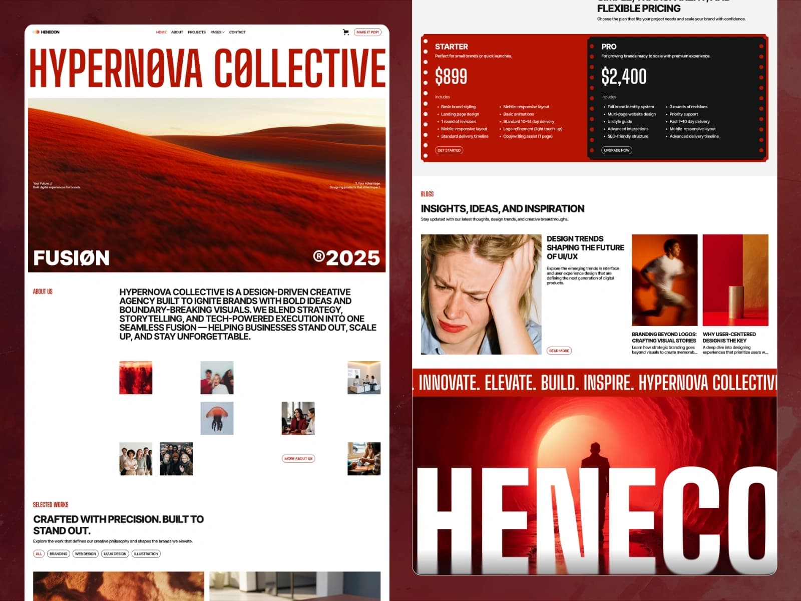
Henecon is a premium, production-ready template for brand studios, design agencies, UI/UX consultancies, illustration practices, and any creative business that shows its work and names a price. Built on Next.js 16, React 19, and TypeScript, it ships with 20 pre-built page templates, an MDX-powered blog and case study system, a working storefront with cart and checkout, and a fully editable content layer — no CMS or backend required.
A creative agency sells confidence before it sells work, and Henecon opens with both: a wall-sized display headline, a full-bleed hero photograph, and a primary red that runs from the first pixel to the footer. Every piece of content lives in JSON or MDX files, so you can launch a real client site in hours without touching the component code.
Tech Stack
Next.js 16 — App Router, server components, static-first rendering
React 19 — latest concurrent features
TypeScript — strict mode, fully typed
MDX — for blog articles and case studies, read with
gray-matterHand-crafted CSS — one plain stylesheet driven by CSS custom properties, no utility framework and no build-time CSS pipeline to learn
Self-hosted fonts — Inter, Big Shoulders Display, Geist and Manrope shipped as local
woff2files, with no third-party font requests at runtimeZero backend lock-in — no CMS, no font CDN, no commerce backend dependency
Included Pages and Templates
Homepage — full-bleed hero, filterable works strip with four category tabs, a scroll-driven process rail that stacks its five cards, an expanding idea rail, a pricing grid, and a brand-zoom call to action scrubbed by the scroll
About — pointer-drift hero photographs, an awards list that swaps its picture as you move down it, a team rail that rolls sideways as the page scrolls, values, socials, and a cookie banner
Projects — a hand-laid index of 6 case studies plus 6 detail pages, each with overview, challenge, approach, design solution, outcome, a three-fact sheet, and a click-to-zoom lightbox gallery
Blog — a featured article above six category filter tabs, plus 10 MDX articles with author byline, category, date, and a related-articles strip
Pricing — a two-plan grid plus 2 plan detail pages with full feature lists and add to cart
Category — 2 category pages for the plan storefront
Contact — contact details and a labelled enquiry form
Checkout, PayPal Checkout, and Order Confirmation — cart-aware flow (no real payment wired; UI demo)
Utility — style guide, license, changelog, privacy policy, terms and conditions, 401 password protected, and 404
Everything prerenders to static HTML — 36 pages, all faithful to the original design.
Easy Content Editing
All editable content lives in the project's src/content folder — you never have to touch component code to launch the site. Update these files in any text editor:
blogMDX files — articles: frontmatter for title, excerpt, category, listing and byline dates, author, and the card, banner and rail photographs; Markdown for the bodyprojectsMDX files — case studies: frontmatter for the banner, the three-fact sheet, the two-image gallery, the full-width still, and both card treatments; Markdown sections for overview, challenge, approach, design solution and outcomeplans.json— the pricing grid: name, blurb, price, feature list, button label, and the accent classes the design gives each cardproducts.json— the plan detail pages: name, blurb, price, feature list, and the values the basket storescategories.json— the two category pages
Each collection's order is one explicit list, and every surface slices it — the blog index, its category tabs, the home page's rail and the related strip all follow from it.
Colours, spacing, and the type scale are CSS custom properties in one :root block — change a value there and it updates the whole template.
Performance and SEO
Server-rendered pages out of the box (App Router) — every route prerenders to static HTML
Self-hosted fonts and images — no third-party CDN requests at runtime
Lazy-loaded imagery throughout, served at the sizes the layout asks for
Open Graph and Twitter card metadata on every page, with an absolute share image URL
Semantic HTML structure, one H1 per page, a skip link, and a route-aware active navigation state
Every control is a real button or link, reachable and operable from the keyboard
Every animation respects the reduced motion setting
Clean, crawlable URLs
Deployment
One-click deploy to Vercel — build settings are auto-detected. Also runs on Netlify, AWS Amplify, Cloudflare Pages, or any Node 20+ host.
What You Get
Full Next.js 16 and TypeScript source code
20 pre-built page templates
Sample content (6 case studies, 10 blog articles, 2 pricing plans, 2 categories)
Self-contained HTML documentation
Comprehensive README with setup and editing guide
Friendly buyer support
Requirements
Node.js 20 or higher
Basic familiarity with the command line
A text editor (VS Code recommended)