 Waida Studio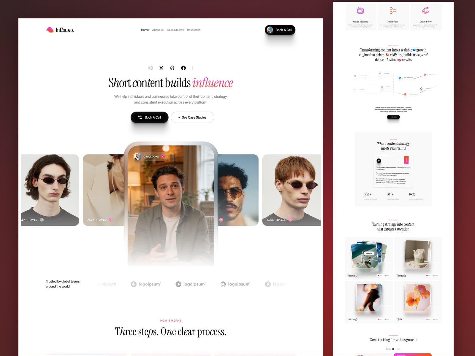
Inflouno is a Next.js 16 template for influencer agencies, creator studios, UGC teams and social-first marketing brands — the kind of business that has to show the work, name the numbers and get a call booked. Built on the App Router with React 19 and TypeScript in strict mode, it ships 15 page templates covering 27 fully static routes, with the case studies and articles driven by MDX files and the pricing grid by JSON. No CMS or backend required.
Whether you run a creator marketing agency, a short-form video studio, a talent roster, a personal brand or a social team inside a larger shop, Inflouno gives you every page the sale needs — six case studies with client, service, timeline and three headline figures each, eight full-length articles, a monthly/yearly pricing switch with a feature comparison table, and a contact page that takes the enquiry. Content lives in files: add a case study and it appears on the home page, on the case-studies index, in the related strip at the foot of every other case study and at its own URL without touching a component.
Tech Stack
Next.js 16 — App Router, every route prerendered to static HTML at build time
React 19 — server components throughout, with one small client island for the interaction layer
TypeScript — strict mode,
npm run typecheckcleanHand-crafted CSS — one plain stylesheet driven by CSS custom properties, no utility framework and no build-time CSS pipeline
Self-hosted webfonts — Inter Display, Libre Caslon Condensed, Rubik and Instrument Serif as woff2, no third-party font requests at runtime
MDX content layer — gray-matter frontmatter with a prose parser that renders into the design's own markup
Zero animation libraries — no jQuery, no GSAP, no Lenis: the character-level nav hover, scroll reveals, bouncing statistics, stat counters, marquees and smooth scrolling are one TypeScript file
Included Pages and Templates
Core pages
Home with a creator video row, a background film with a real play/pause control, a three-step process section, a case-study grid whose stacked screenshots fan apart on hover, a drifting testimonial column, a comparison panel, a pricing grid with a monthly/yearly switch and an FAQ accordion
About with mission statistics that bounce into place on a stagger, a second background film, a team grid, an awards list and a client logo marquee
Pricing with the monthly/yearly switch, a full feature comparison table and its own FAQ
Contact with a fully labelled enquiry form, the agency details and a map panel
Case studies
Case-studies index and 6 case study pages: client, service, category and timeline, a two-part strategy write-up, a results section and three headline figures each
Resources
Resources index listing every article, and 8 full-length articles with category, published date, reading time, author, a bullet list and a pull quote
Utility pages
Style guide, licences, changelog, privacy policy, terms, a 401 password-protected page and a 404 page
15 page templates. 27 static routes.
Easy Content Editing
Everything you change lives in src/content/. Edit a file, rebuild, done.
src/content/blog/*.mdx— the 8 articles: category, published date, reading time, author, card and hero images, and the bodysrc/content/cases/*.mdx— the 6 case studies: the lede, the four-row client sheet, the three result figures, the card image and its two counts, and a two-part write-upsrc/content/plans.json— the pricing grid: both billing periods, both cards, the price, the feature list and the class each slot carries
Each file states its own order, so the sequence the design was built around lives with the content instead of in a separate index. Mark a case study featured and it joins the grid on the home page and the index; leave it off and it keeps its own page without appearing in a list.
Body copy is Markdown: headings, paragraphs, bullet lists and pull quotes, which is the whole vocabulary the design uses. A prose parser places each block inside the design's own markup, so the words stay editable and the layout stays exact.
Theming is one file. Every brand colour, font, spacing step and type size is a CSS custom property in the :root block at the top of public/assets/css/styles.css. Change a value there and it propagates across every page.
Performance and SEO
Every route prerendered as static HTML, ready for a CDN
Per-page title, description and Open Graph and Twitter card metadata
Absolute share-image URLs so link previews resolve
Self-hosted fonts with
font-display: swapand zero third-party requestsLazy-loaded imagery with responsive
srcseton the photographyBackground films carry a poster frame and a real play/pause control
Semantic markup with one H1 per page, real buttons, a skip link and landmarks
Keyboard-reachable pricing tabs, accordions, navigation and forms
Full
prefers-reduced-motionsupport, and readable with JavaScript off
Deployment
Deploys to Vercel, Netlify, Cloudflare Pages or any static host. npm run build prerenders every route; there is no server, no database and no API to configure.
What You Get
The complete Next.js 16 project source
15 page templates covering 27 static routes
8 articles and 6 case studies as editable MDX
The pricing grid as one JSON file
The original stylesheet, three background films and self-hosted webfonts
Full HTML documentation
Changelog and third-party license file
Requirements
Node.js 20 or newer
npm 10 or newer, or pnpm, yarn or bun