 Waida Studio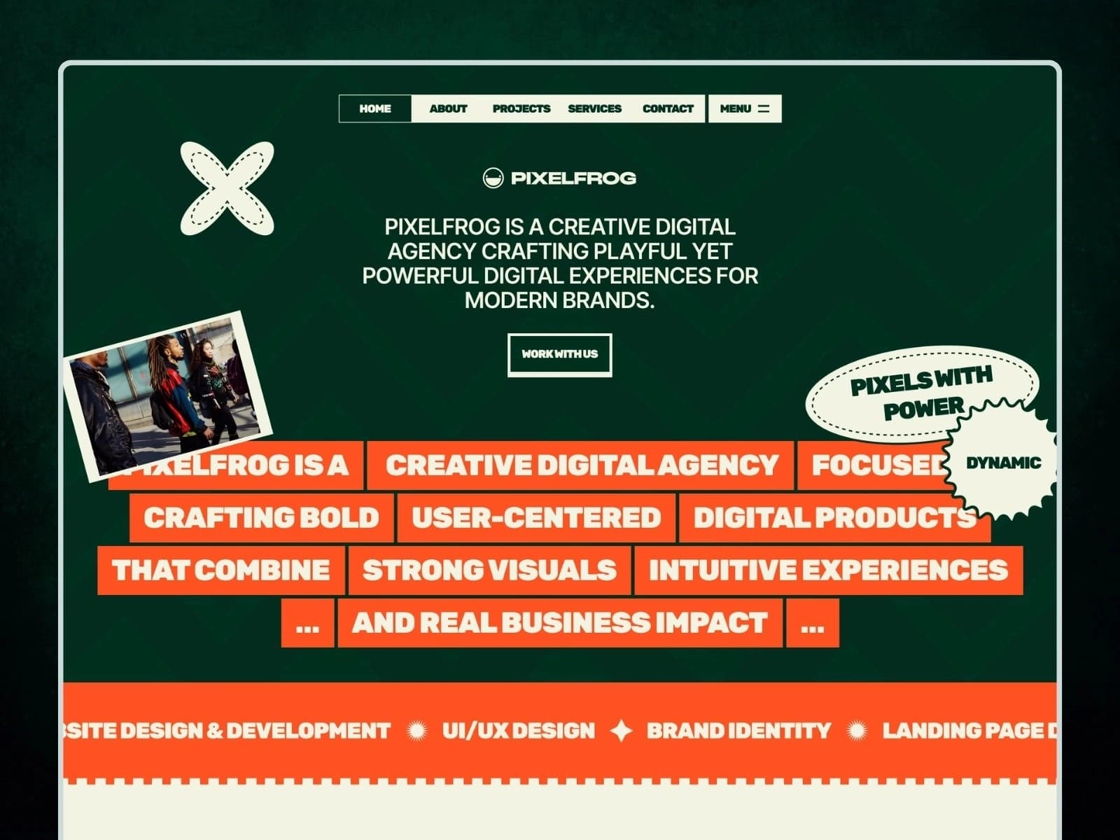
A studio that makes playful work has to look like it can. Pixelfrog opens on a deep forest green, an orange that does not apologise, and a wall of Rubik Black set at display size — then puts a running ribbon of type on a curved path across the middle of the page and lets the work do the rest. Built on the Next.js 16 App Router with React 19 and TypeScript in strict mode, it ships 16 page templates covering 25 fully static pages, with the case studies, articles and pricing plans driven by MDX files you edit directly. No CMS or backend required.
Whether you run a design studio, a UI/UX consultancy, a branding practice or an independent portfolio, Pixelfrog gives you every page the pitch needs — five case studies with their own client sheets and click-to-zoom galleries, a six-article design blog, a services page whose four rows take turns as you point at them, two pricing plans with their own pages, and an about page whose statistics count up as you reach them. Content lives in files: add a case study and it appears on the projects page, in the chain under every sibling, and at its own URL without touching a component.
Tech Stack
Next.js 16 — App Router, every page prerendered to static HTML at build time
React 19 — server components throughout, with one small client island for the interaction layer
TypeScript — strict mode,
npm run typecheckcleanHand-crafted CSS — one plain stylesheet driven by CSS custom properties, no utility framework and no build-time CSS pipeline
Self-hosted webfonts — Rubik and Inter as woff2, no third-party font requests at runtime
MDX content layer — gray-matter frontmatter with a prose parser that renders into the design's own markup
Zero animation libraries — no jQuery, no GSAP, no Lenis: the scroll reveals, the marquees, the scrubs, the sliders, the lightbox and the type ribbons are one TypeScript file
Included Pages and Templates
Core pages
Home with a word-by-word heading that darkens as you scroll past it, a services rail that hands its open row to your pointer, a process section that stacks three cards and fans them apart, two case studies, a testimonial slider, an FAQ accordion and a six-card article rail
About the studio with three counting statistics, six framed photographs that slide together, a team rail that swaps its portrait as you move down it, the client logos and an FAQ accordion
Services with four rows that take turns, three tilted cards that fan in from the edges, the strategy rail and a running type ribbon
Contact with a labelled enquiry form, the studio details and an FAQ accordion
Work
Projects index with five alternating case-study cards, and 5 case study pages: the banner, the client sheet, the concepts write-up and a click-to-zoom gallery
Blog
Blog index and 6 full-length articles, each with its category, reading time, author line, banner and two galleries
Pricing
Pricing page with two plans and a comparison, and 2 plan pages with their own inclusions list
Utility pages
Style guide, licenses, changelog, a 401 password-protected page and a 404 page
16 page templates. 25 static pages.
Easy Content Editing
Everything you change lives in src/content/. Edit a file, rebuild, done.
src/content/blog/*.mdx— the 6 articles: the category, the date, the reading time, the author, the card and banner images, and the three-section bodysrc/content/projects/*.mdx— the 5 case studies: the summary, the four fact rows, the banner and card pictures, the concepts write-up and which case study comes nextsrc/content/plans/*.mdx— the 2 plans: the name, the price, the icon and the list of what is includedsrc/content/layout.json— the galleries the design sets between an article's sections, the pictures under every case study, and which two case studies the home page shows
Every card reads the item's own entry, so a retitled article is retitled on the blog index, in the slider that closes eight other pages, and on its own page at once — with no component to touch.
Body copy is Markdown: headed sections, paragraphs and a flat list. A prose parser places each block inside the design's own markup, so the words stay editable and the layout stays exact. Reach past that grammar and the build stops and names the file, rather than rendering something the design has no styling for.
Theming is one file. Every brand colour, font, spacing step and type size is a CSS custom property in the :root block at the top of public/assets/css/styles.css. Change a value there and it propagates across every page.
Verified Against the Original
All 25 pages were compared against the original template tag for tag, attribute for attribute and text run for text run — in the body and in the head — both locally and against the deployed build, and every page's rendered height was checked at four widths. The stylesheet is the original, used unchanged. Sixteen components stand in for markup that repeated across pages, replacing 1,364 copies of the same blocks with sixteen definitions that render the original markup exactly.
Performance and SEO
Every page prerendered as static HTML, ready for a CDN
Per-page title, description and Open Graph and Twitter card metadata
Absolute share-image URLs so link previews resolve
Self-hosted fonts with
font-display: swapand zero third-party requestsLazy-loaded imagery with responsive
srcseton every photographSemantic markup with one H1 per page, real buttons and landmarks
Keyboard-reachable navigation panel, accordion, sliders, lightbox and forms
Full
prefers-reduced-motionsupport, and readable with JavaScript off
Deployment
Deploys to Vercel, Netlify, Cloudflare Pages or any static host. npm run build prerenders every page; there is no server, no database and no API to configure.
What You Get
The complete Next.js 16 project source
16 page templates covering 25 static pages
6 articles, 5 case studies and 2 plans as editable MDX
The original stylesheet and self-hosted webfonts
Full HTML documentation
Changelog and third-party license file
Requirements
Node.js 20 or newer
npm 10 or newer, or pnpm, yarn or bun